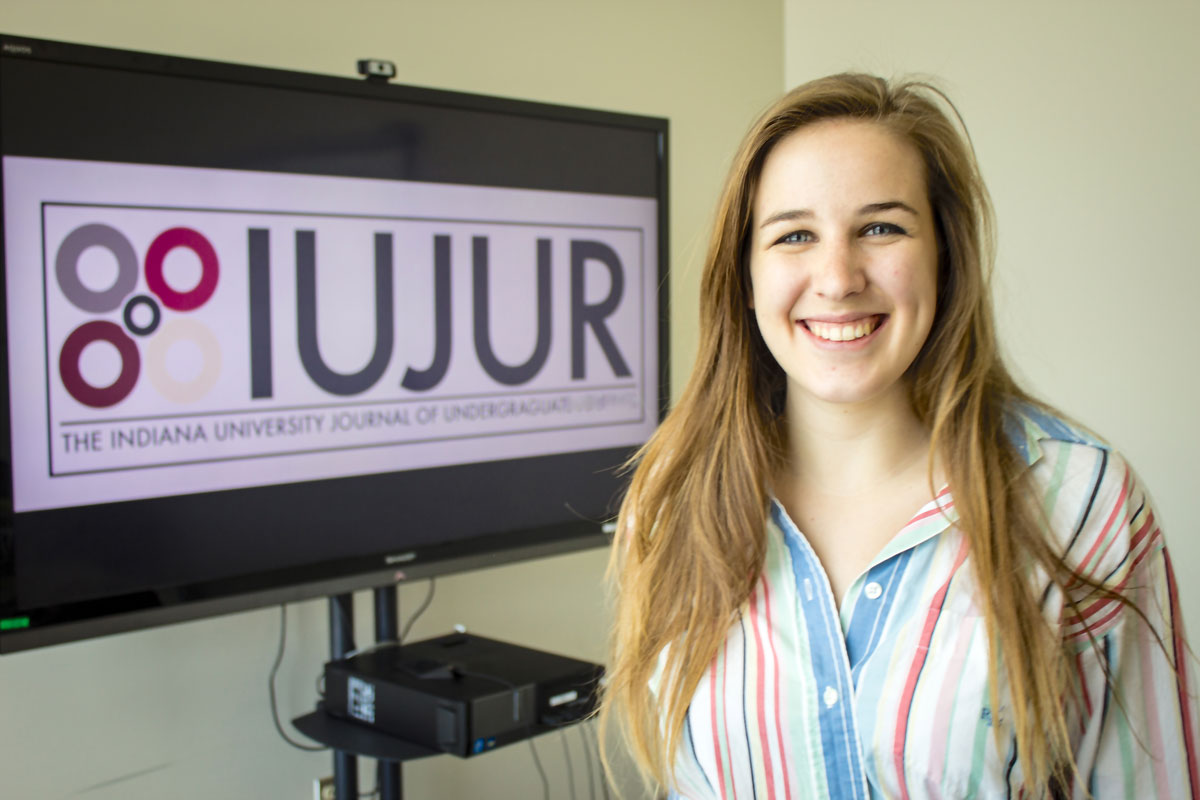
“I really like how a simple image can have a deeper meaning than the surface,” Martin explained, “so to me the four circles represented the four fields that the journal incorporates and how they – despite being four completely different entities – can all come together to a focus point, that being the journal.
“Even though the four separate entities approach their research in separate ways, they are all trying to get information out in the same way – through the journal.”
Martin added that she used this rationale to design the logo around the Journal’s four fields of research – Natural Sciences, Social Sciences, the Humanities, and Pre-Professional Schools – and incorporated colors for IU’s color palette to emphasize the unity that a university-wide research journal promotes.
Building from this symbolic foundation, Martin then combined knowledge gained from UITS design and publishing workshops she had recently taken to draft dozens of potential logo ideas. “I can’t tell you how many versions of this logo I had on my computer – maybe 60 copies in various folders – and I really didn’t mind doing it,” she said, laughing. Then, she sought a professional opinion.
“I talked to Kevin Steele, a design professor from [the Henry Radford Hope School of] Fine Arts, who suggested graphic design reference guides. He also suggested incorporating the Futura font because it was built with geometric round shapes like the circles and would help the logo flow throughout,” she added
Martin submitted multiple versions of the logo and said that although she did not expect to win the competition, practicing design helped convince her to follow her passion for visual and graphic design.
“I didn’t expect to win at all,” she said. “I just really wanted to practice the programs I’d been learning in my free time. Once it came back that I had won, it was an eye-opener that maybe I really can build upon my skills and the experience I have and build up to a career in design one day. Especially because I enjoyed doing it, that definitely meant that I could put the time into doing it and getting better at it, because the more you do something the better you will do it.”
Shortly before receiving the notification that one of her logos had been selected, Martin said her design experience had inspired her in part to apply to the University’s Individualized Major Program in the fall to pursue studies in Graphic Design and Visual Communications.
When asked what she hoped the IUJUR audience would take from her logo, Martin said, “I hope that they will explore the symbol and discover its meaning. I hope it becomes something that they associate with IUJUR, and hopefully this association with a simple image will help them take action…I want people to submit. I really think people should use this opportunity to publish and get in print because this is one of the few opportunities you have to try it out before you go into the world and do it for a living. Also, I hope people get involved because these are concrete skills they can build on and gain knowledge from.”


